 Type in another

Mastering Ceramic Colors: A Practical Guide to Choosing Your Palette
Ceramics have long held a pivotal role in human culture, seamlessly blending functionality with artistic expression. When it comes to ceramic dinnerware, serveware, and drinkware items, the palette of colors employed plays a crucial role in influencing perception and enhancing the overall dining experience. Hence Understanding the intricacies of various colors is essential for crafting captivating ceramic items.
So in this guide, we’ll explore the psychology of colors specifically tailored for ceramic dinnerware, serveware, and drinkware items, providing insights into the diverse range of hues suitable for these functional and aesthetic pieces.
The Psychology of Colors in Ceramic Dinnerware, Drinkware & Serveware
The significance of Colors in ceramic items goes beyond aesthetics—they evoke emotions and convey messages, making them integral elements of the dining experience. So let’s delve into the psychological aspects of a versatile palette.
Earthy Tones for Timeless Charm:
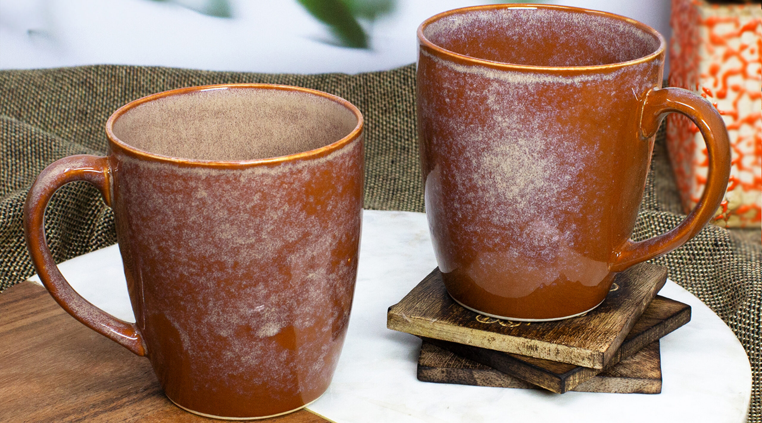
Terracotta: The warm and inviting reddish-brown hues of terracotta create a sense of rustic charm. Hence making it a timeless choice for both functional and decorative dinnerware.
Umber: A darker, earthy brown, umber imparts richness and depth, making it an excellent choice for accentuating details in ceramic dinnerware, serveware, and Drinkware items.
Cool Blues and Greens for Refreshing Appeal:
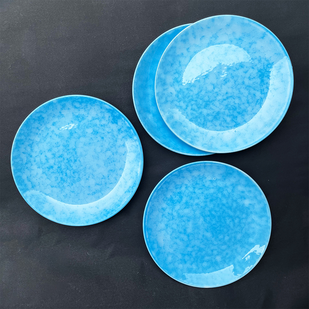
Turquoise: Evoking tranquillity and calmness, turquoise glazes transport diners to coastal landscapes. Ideal for decorative pieces or tableware, it infuses a refreshing ambiance.
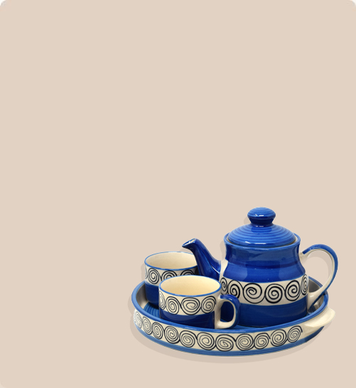
Blue: Radiant and soothing, blue adds a touch of sophistication. It’s versatile, and suitable for both decorative and functional ceramics, providing a sense of serenity.
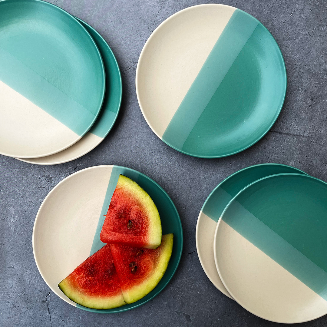
Green: Symbolizing nature and growth, green imparts a lively yet grounded feel, making it a suitable choice for planters and nature-inspired serveware.
Bold Reds and Yellows for Focal Points:
Red: Bold and passionate, red demands attention, conveying energy and intensity. Use it strategically for accent pieces or to create focal points in your dinnerware collection.
Yellow: Vibrant and optimistic, yellow uplifts the mood and adds a sunny disposition. Perfect for decorative drinkware items, it brings joy to your ceramics.
Orange: A warm and subdued hue, orange exudes coziness and comfort. It’s an excellent choice for creating a welcoming atmosphere in functional and decorative dinnerware.

Neutral and Pastel Tones for Elegance:
Ivory: Timeless and elegant, ivory adds a touch of sophistication to ceramics. It’s versatile and complements a wide range of styles, making it suitable for various artistic expressions in dinnerware and serveware.
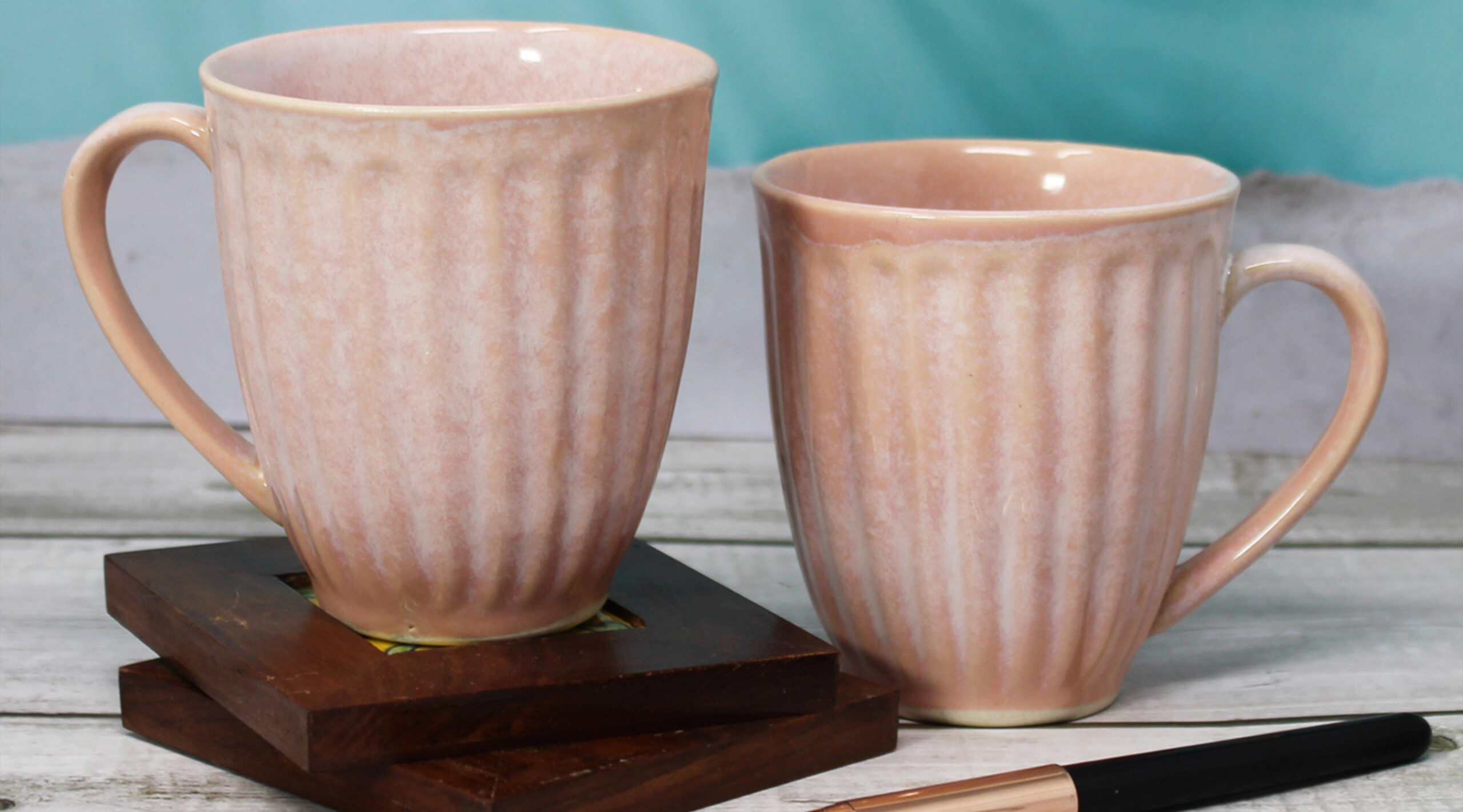
Pink: Soft and delicate, pink brings a sense of sweetness and femininity to ceramics. Hence Ideal for decorative drinkware pieces, it creates gentle contrasts in your collection.
Gray: Modern and understated, Gray provides a neutral backdrop that enhances the visibility of intricate details. It’s a contemporary choice for both functional and decorative ceramics.
Purples and Lavenders for Opulence:
Amethyst: Regal and luxurious, amethyst adds a touch of opulence to ceramics. So use it sparingly to create a sense of mystery and elegance in your dinnerware and serveware.
Lavender: Calming and graceful, lavender hues bring a sense of tranquillity. Suitable for drinkware and serveware items, it creates a serene and peaceful atmosphere.
Mauve: A muted shade of purple, mauve combines sophistication with subtlety. Hence making it an excellent choice for adding understated elegance to your ceramic products.
Creating a Cohesive Color Palette for Your Ceramic Dining Products
Beyond color psychology, practical considerations are equally important when selecting a color palette for ceramic dinnerware, serveware, and drinkware items.
Functionality:
Consider the intended use of your ceramic pieces. Functional dinnerware may benefit from neutral or calming colors, while decorative drinkware offers flexibility for more expressive hues.
Temperature of Colors:
Consider the temperature of colors in your palette. Warm colors can create a sense of energy and vibrancy, while cool colors impart a calming and tranquil atmosphere. While well-balanced palette with a mix of warm and cool tones provides visual interest and harmony.
Textural Variations:
Explore textural variations within your color palette. Different glazes and finishes can add depth and complexity to your ceramics. Hence enhancing the overall visual appeal of your dinnerware, serveware, and drinkware.
Accentuating Details:
Use color to accentuate the details of your ceramic pieces. Employ lighter or darker shades to highlight intricate patterns, textures, or sculptural elements, adding dimension and drawing attention to craftsmanship.
Inspiration from Nature:
Nature serves as a timeless muse for color inspiration. Explore palettes found in landscapes, flora, and fauna to create a connection with the organic world, adding a timeless and universally appealing quality to your dinnerware and serveware.
Consider Cultural Influences:
Incorporate colors with cultural significance, adding depth and allowing for a rich narrative that engages users on a cultural level.
Transitions and Gradients:
Experiment with color transitions and gradients in your dinnerware, serveware, and drinkware. Gradual shifts from one color to another can create a sense of movement and fluidity.
Timeless Classics:
Incorporate timeless classic colors like whites, blacks, and neutral tones as versatile anchors in your palette. These classics provide a timeless backdrop that allows other colors to shine, contributing to the longevity and versatility of your dinnerware, serveware, and drinkware.
Seasonal Variations:
Explore seasonal variations in your color palette for dinnerware, serveware, and drinkware. Introduce warm tones for fall-themed collections or cool hues for spring and summer, adding a dynamic and ever-changing aspect to your ceramic art.
Shop Premium Ceramic Dinnerware, Serveware & Drinkware from TAE
When it comes to ceramic dining essentials – encompassing dinnerware, serveware, and drinkware – the choice of colors plays a crucial role. Beyond enhancing the visual appeal, your color selection weaves a narrative of emotions and stories. By grasping the basics of color psychology, considering practical aspects, and establishing a cohesive palette, you can elevate the overall dining experience.
Shop one of the best ceramic products from The Artisan Emporium and choose from a variety of Color options according to your functional and aesthetic needs to create the desired color palette in your ceramic dining items.
So Shop Today from The Artisan Emporium and get amazing offers.
-
17%

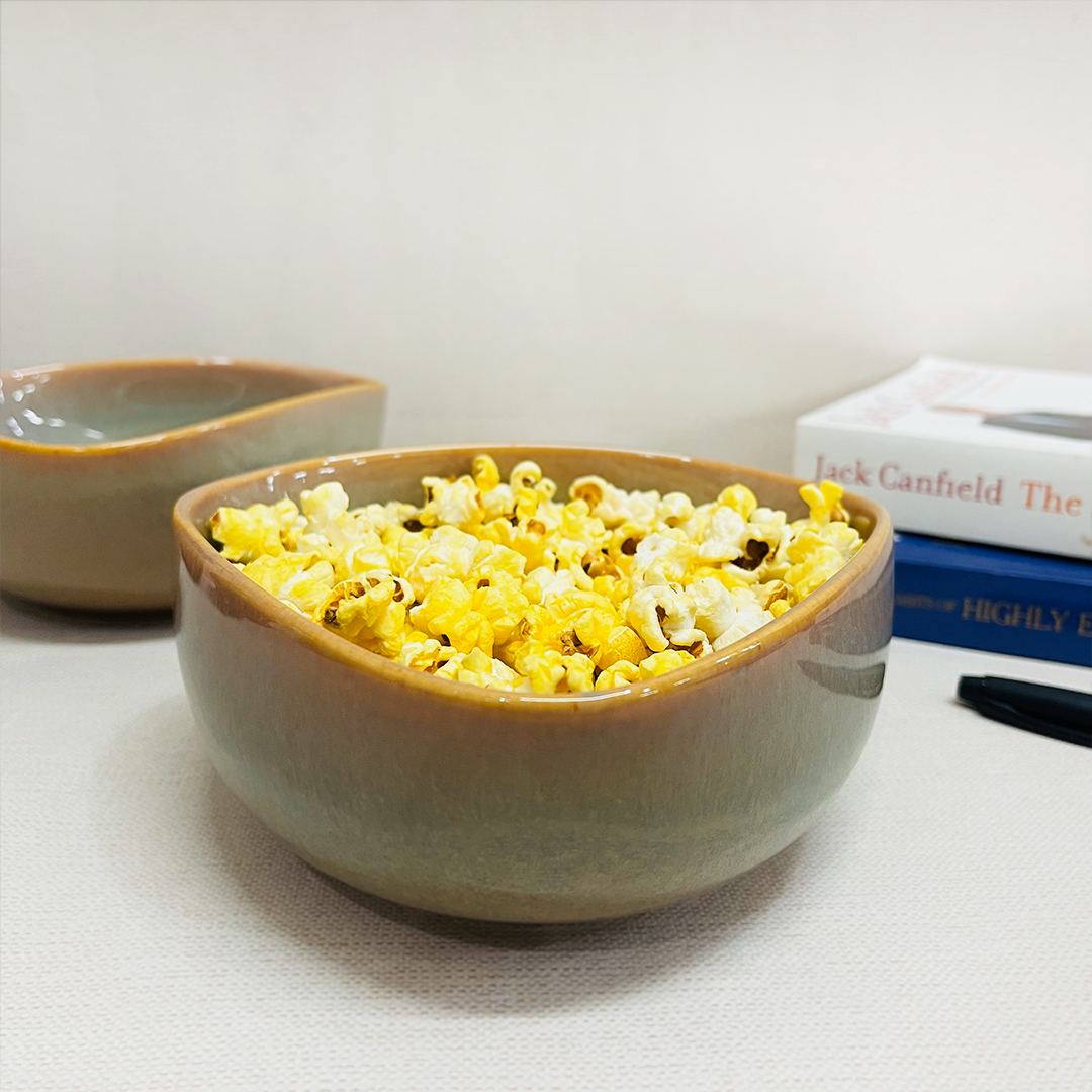
Rusty Brown Triangle Ceramic Snack Bowl 650ml | Serving Bowl
₹1,311.00 17% Off/- Shop Now -
17%
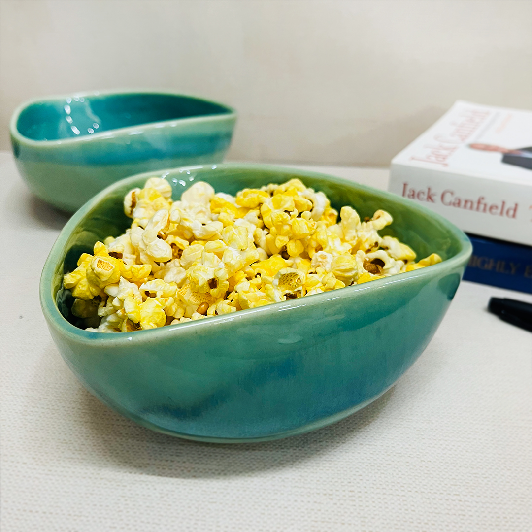
Sea Green Triangle Ceramic Snack Bowl 650ml | Serving Bowl
₹1,311.00 17% Off/- Shop Now -
17%
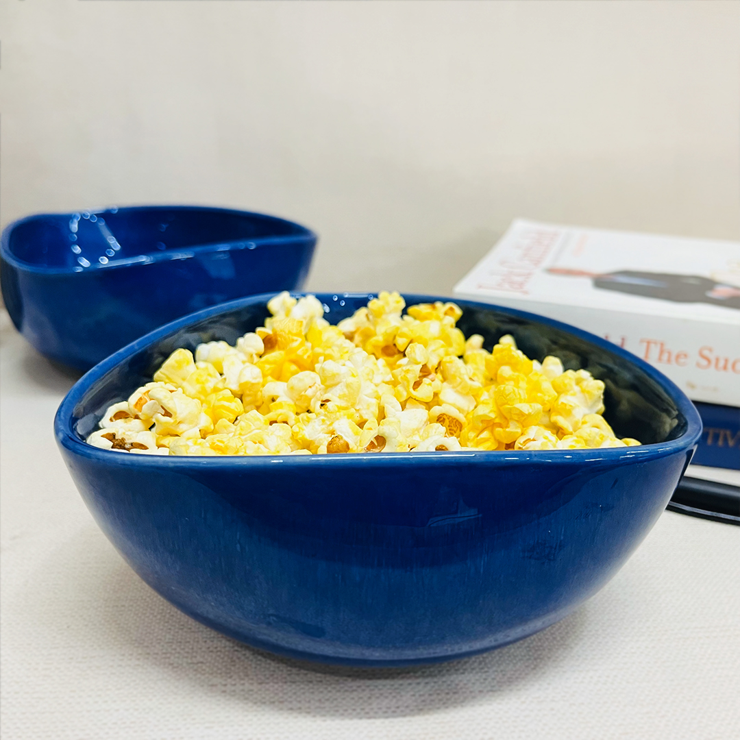
Sapphire Blue Triangle Ceramic Snack Bowl 650ml | Serving Bowl
₹1,311.00 17% Off/- Shop Now -
38%
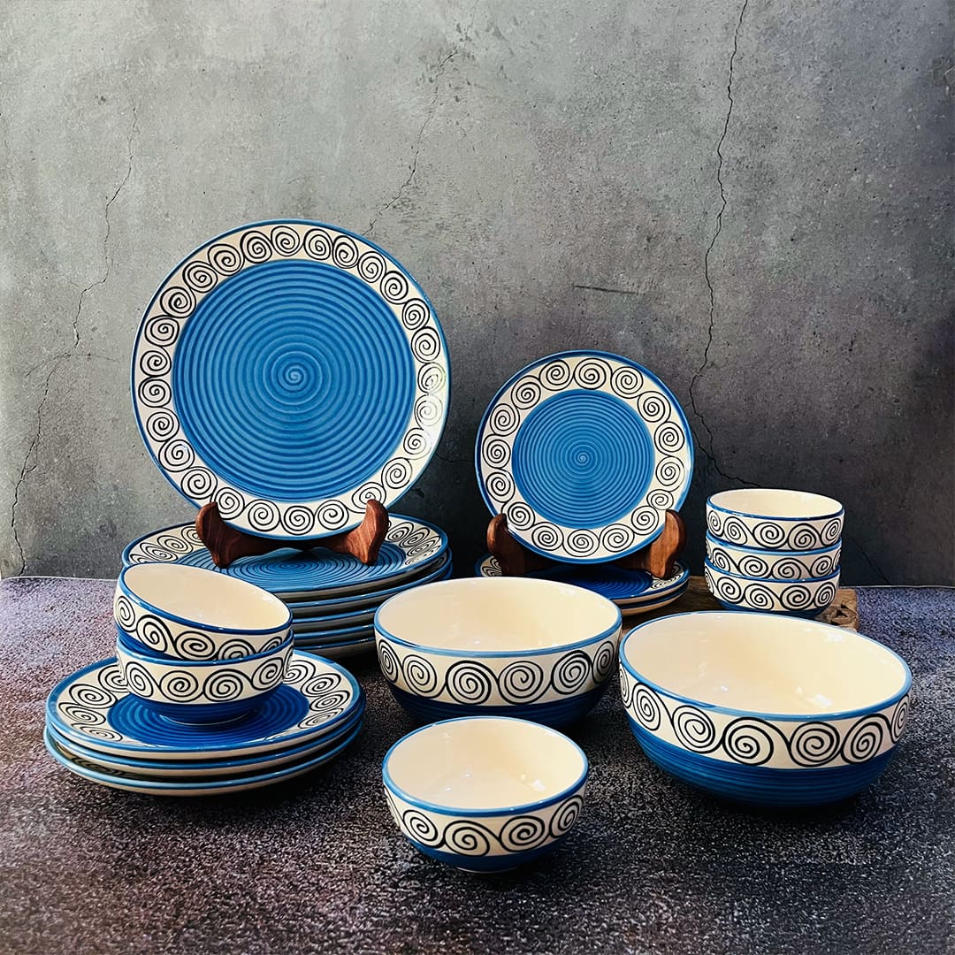
Blue Swirl Hand painted Ceramic Dinner Set of 20 Pieces (Serving For 6)
₹5,945.00 38% Off/- Shop Now